


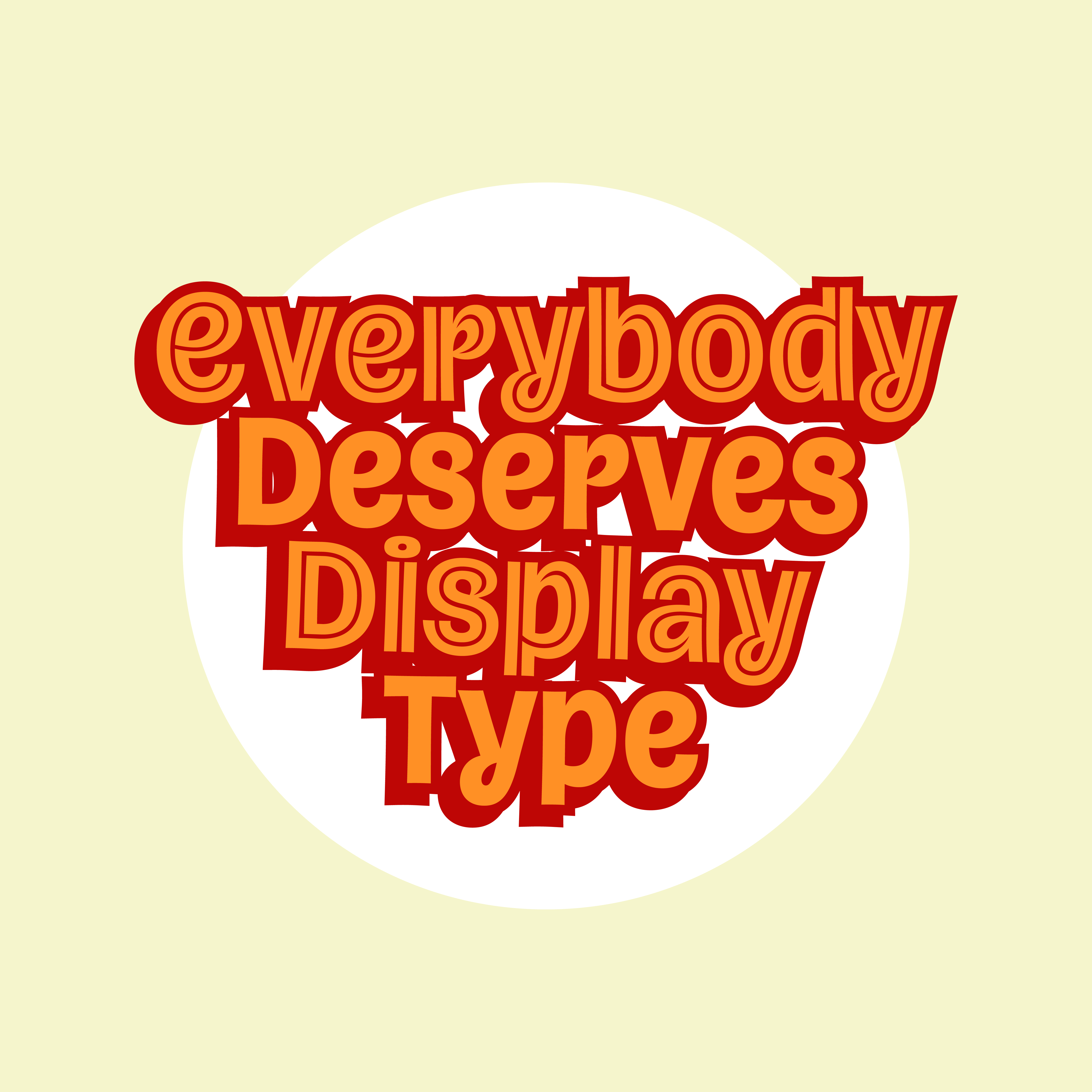
Chokecherry v0.1 on Future Fonts!

Hey, friends!
Here’s a little surprise. It still feels unexpected even to me. A new release, my first ever, is available today on Future Fonts! It’s called Chokecherry, and I’m so excited to have it out there!

If you read my last newsletter (which I sent last year, because I’m a terrible newsletter-sender), you saw that I have long planned for my first release to be a type family called Afternoons. So why is Chokecherry out first? Well, first, my work on Afternoons stalled when I started getting busy with contract and custom work, which I really enjoy. Then, in February of this year, I got hit by three viruses back to back to back—laryngitis, then Covid (fairly mild, thankfully) a week later, and then strep a week after that. Needless to say, I was wiped, and for almost a month afterward, I couldn’t get my brain to work on anything.
So one day in March, I set myself a goal: open up Robofont and draw one character, any character. The character I drew ended up being the loopy lowercase ‘k’ in Chokecherry. It snowballed from there, and it became something I would pull up and work on as a warm-up in the mornings. It was breezy and fun, and it got my brain into work mode.

I started to draw the Cherokee characters early in the process, because, as a citizen of the Cherokee Nation, I’m committed to supporting the syllabary in everything I make. As for the design itself, I was pulling in influences from handwriting (both Latin and Cherokee) to sign painting to packaging and old phototype. After a while, I noticed my little morning side-project, while limited, had become pretty usable, so on a whim, I pitched it to the lovely people at Future Fonts. I was thrilled when they accepted it, and they’ve been a dream to work with!
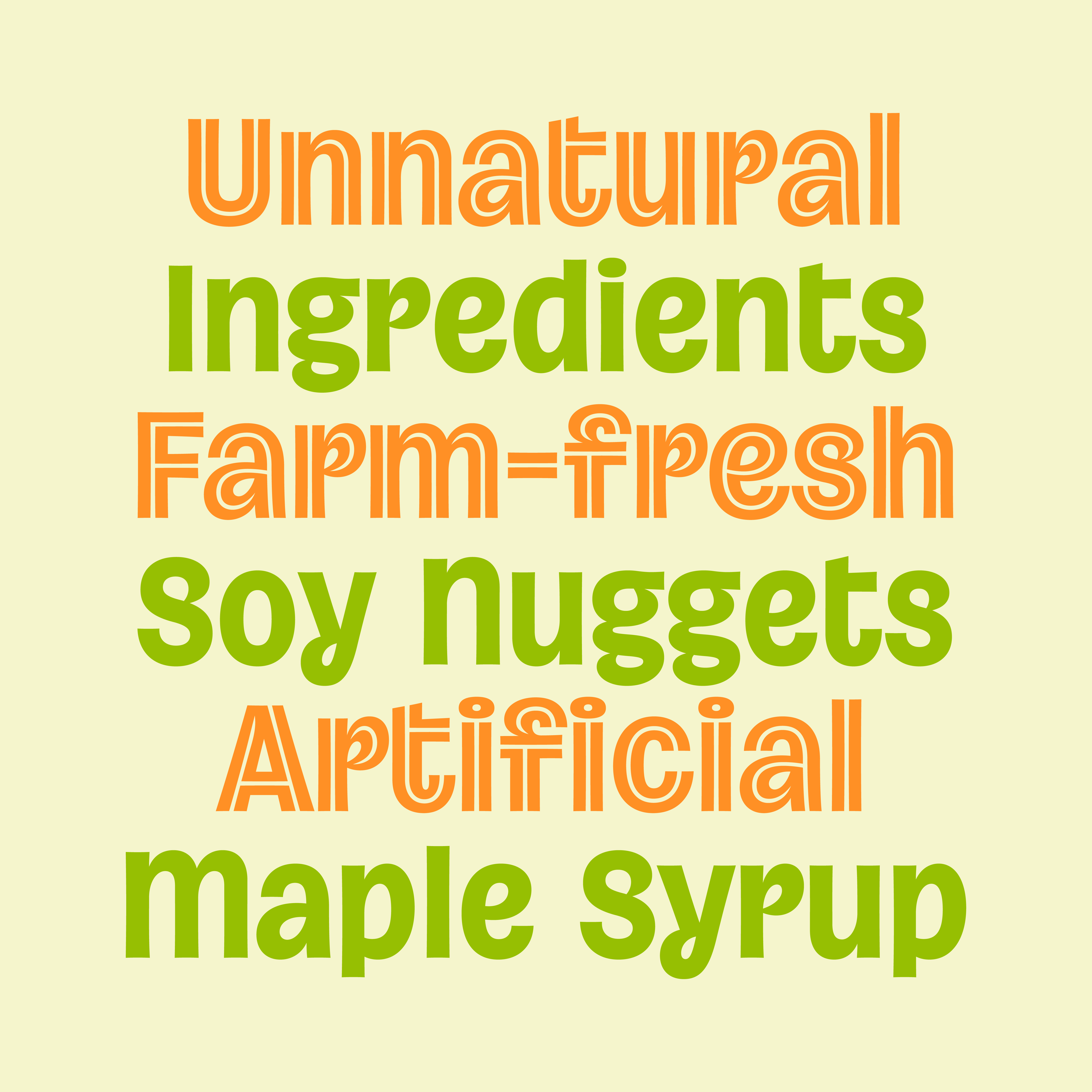
Chokecherry is a lively sans for Latin and Cherokee. Its shapes are informed by handwriting ductus, including accidental flicks of the wrist that lead to unexpected closed loops with leaf-shaped counters. Chokecherry’s giant x-height and gently eccentric forms make it ideal for logos, headlines, packaging, and other display uses.
The initial version includes two styles, Bold and Inline, that can be used together or separately. This is my first step in addressing the lack of display type that supports the Cherokee syllabary.
It’s been a long decade-plus journey, during which I’ve often gotten derailed by perfectionism or, more recently, just general busyness with work and life. But I’ve finally released something, and it feels amazing! I’ll have more news on long-term projects coming very soon, but in the meantime, check out Chokecherry on Future Fonts. I’d love to hear what you think, and I hope you’re all having a wonderful week!
Take care,
Chris
Super duper congrats! What a cool followup from your TypeCon 2024 talk I still like to think about. Hope you are regaining normalcy, at your own pace.
Omg!! Congrats!!!! A huge accomplishment and it looks incredible!! 🎉🎉🎉